Lens-Artists Challenge #335: Exploring Colour vs Black & White
Lens-Artists Challenge #335: Exploring Colour vs Black & White
This week, Patti of Creative Exploration in Words and Pictures is hosting the Challenge and she's asking us to look at our use of colour or black & white (https://pilotfishblog.com/2025/02/08/lens-artists-challenge-335-exploring-color-vs-black-white/#comment-199680) in our photography. 'When is it best to use one vs the other?' She ponders: 'What’s the benefit of each one?'
Patti sets us a challenge, 'to explore the difference and the impact of using color [sic] or black & white photography in your selected photos. ... Post pairs of the same image in both color and black & white. Limit the number of images to 3 pairs.' She continues by asking us to: 'Compare the differences in mood, texture, and light. Share your thoughts on how black & white or color processing impacts each photo. Tell us which one you prefer.'
I tend to use colour a lot in my photography, especially in film photography where I'm a big fan of those colour shifting emulsions like Lomochrome Turquoise or Purple. But in my digital work, I'm a little less ... picky.
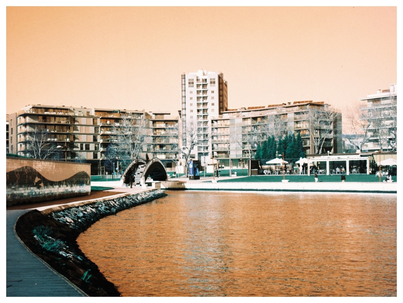
Often it will depend on the subject. Most of my intentional camera movement (ICM) work is done in colour, I feel that ICM benefits from colour a lot, but the exception is urban ICM, which I think is much better in black and white. Similarly, if I'm out recording some street art then that always deserves colour — even if, or especially if, it's starting to decay.
Sometimes, though, I set out to make images in black and white, then create colour images from them. There's nothing I like more than taking an old digicam from the 2000s (the noughties) and testing out the infrared sensitivity of its lovely, lovely CCD sensor. This is often the first thing I do with every new digital camera I get my hands on, and the results can be ... interesting.
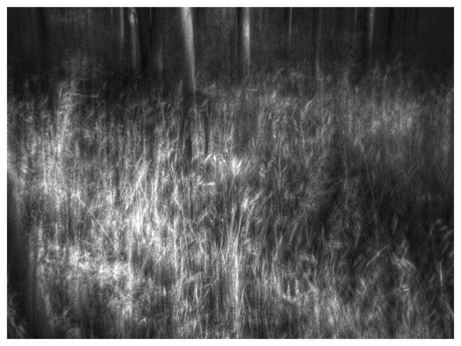
For example, here is a black and white infrared image of the steel footbridge over the Parque de Infante Dom Pedro in Aveiro. Taken with a Samsung Digimax U-CA3 digital camera from 2003, the camera has been set to monochrome mode and the image taken through a Hoya 720nm Infrared filter. It's a typical looking infrared image, with white vegetation, which reflects the infrared wavelengths falling upon it, and dark skies and the metal of the bridge, which do not.
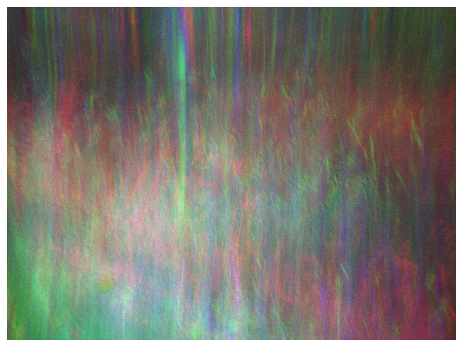
But when you take more monochrome images, using red and green filters, and edit the images as layers in a photo editor, everything changes. Suddenly the vegetation becomes shades of red, the sky becomes a bright blue or turquoise, and the image just pops. This is what I call a digital aerochrome, after the long defunct colour infrared emulsion made by Kodak and based on the procedure devised by Joshua Bird. He developed his method using infrared film, but the same technique (https://joshuabird.com/blog/post/recreating-aerochrome) applies to digital photography as well.
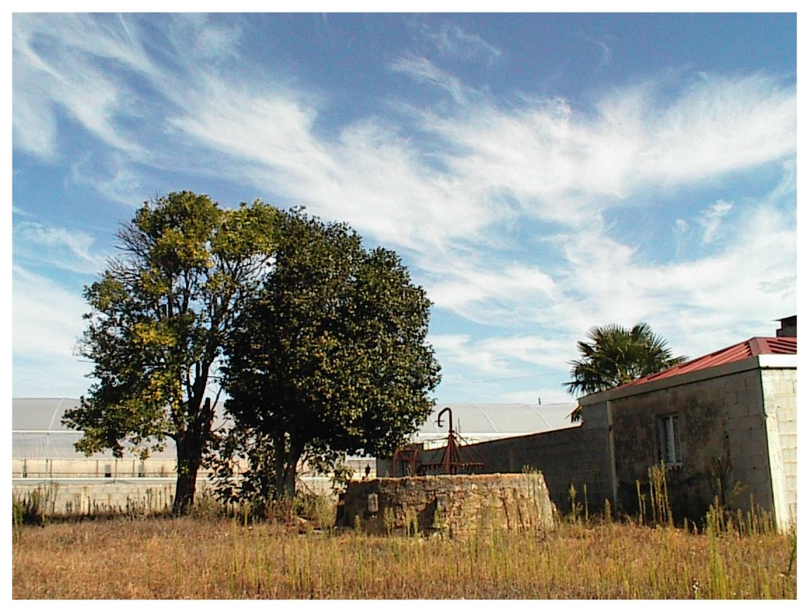
You can have a lot of fun with a digital camera and a set of filters. Take this infrared image of a landscape with lovely wispy clouds in the sky. It's a nice infrared image in black and white, with the clouds popping against a dark sky. But make it into a digital aerochrome and suddenly the clouds become a kaleidoscope of colour. This is down to the clouds moving in the sky between the three exposures. When the images are lined up in the photo editor the colours of the filters don't match and are presented in the image as individual colours.
Of course, it doesn't always go as planned. Turns out this Konica Q-M100, a 1,3MP digital camera from 1997, can't actually be set to monochrome mode, and the digital aerochromes were absolutely awful. That said, the regular colour images were quite stunning, but through an infrared filter, all of a sudden the image became almost monochrome in appearance. It looked as though a sepia filter had been applied, and personally I found this much more appealing than the colour image.
So instead of using these noughties digicams for 'regular' colour photography, odds are that during the sunny spring and summer months you'll find me wandering around the woods behind our house or in Aveiro with a noughties digicam set to monochrome mode and my little collection of filters.
Next week, Ann-Christine will host the Challenge, so I hope that you can join us then. Themes for the Lens-Artists Challenge are posted each Saturday at 12:00 noon EST (which is 4pm, GMT) and anyone who wants to take part can post their images during the week. If you want to know more about the Challenge, details can be found here (https://photobyjohnbo.com/about-lens-artists/), and entries can be found on the WordPress reader using the tag 'Lens-Artists'.
If you are on Mastodon, you can now follow this blog directly. Just go to Mastodon and follow the 'Snapshot' WordPress account at @keithdevereux.wordpress.com@keithdevereux.wordpress.com. All new posts will be automatically updated to your timeline.
#BlackAndWhite, #Colour, #LensArtists, Lens-Artists, #Challenge, #VintageDigital, #Infrared, #Tree, #Landscape, #Nature, #Monochrome, #Aerochrome, #Trichrome, #TrichromeEverything,


Comments
Post a Comment